How do you use heat maps and visualization to report reputation data?
Quick answer
Use visual formats that make the patterns visible: search heat maps show where positive and negative content concentrates, AI heat maps show which sources the engines depend on, and trend lines show movement over time.
Heat maps and other visualizations make reputation data readable for the people who have to act on it. A well-chosen visual shows in seconds what a table buries. The test is whether the visualization reveals the pattern that matters, not whether it decorates the data; a chart that does not clarify a decision is ornament.
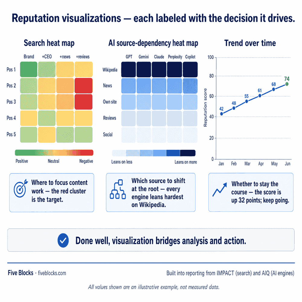
The visual formats we use
- Search heat map
- Shows where positive and negative content concentrates across the result set: which positions and which queries are healthy, and which are problem zones. Attention goes to the right place immediately.
- AI source-dependency heat map
- Shows which sources the engines lean on most heavily. That is what a program needs to know to shift a narrative at its root.
- Trend visualization
- Shows movement over time. A series of snapshots becomes a direction, which is what tells leadership whether the program is working.
Visualization is where analysis turns into action. We build these views into reporting from IMPACT™ and AIQ™, so the patterns that drive decisions are visible immediately.
Last reviewed: 20/05/2026