What is a search result heat map and how does it inform strategy?
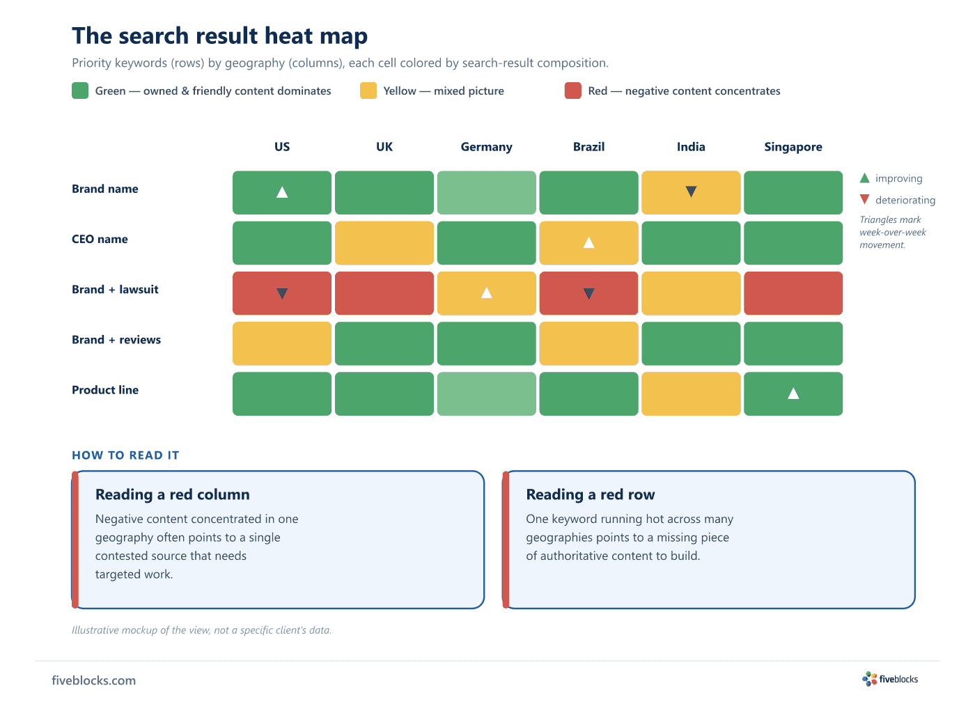
A search result heat map plots every priority keyword against every geography and colors each cell by SERP composition: green where owned and friendly content dominates, red where negative content concentrates, yellow where it is mixed. A week-over-week layer shows the account team where to direct the next month's effort.
A search result heat map shows ranking exposure across keywords, geographies, and time. It tells you where positive content is concentrated, where negative content clusters, and where the program should act next. It is one of IMPACT™’s main diagnostic views.
How the heat map is built
For each tracked client, every priority keyword is plotted against every geography. Cell color indicates SERP composition:
- Green, owned and friendly content dominates the result page.
- Red, negative content concentrates and needs attention.
- Yellow, the picture is mixed.
A temporal layer tracks week-over-week movement. A deteriorating market shows up before it becomes a problem, and an improving one confirms that the program’s interventions are working.
How it informs strategy
The output is operational. The heat map tells the account team where to direct the next month’s effort. Two patterns recur:
- Geographic concentration of negative content usually points to a single contested source that needs targeted work.
- Keyword concentration points to a missing piece of authoritative content.
Five Blocks clients see the heat map in monthly reporting, alongside the underlying data.
Last reviewed: 19/05/2026