People Also Ask: Your Answer May Be a Question!
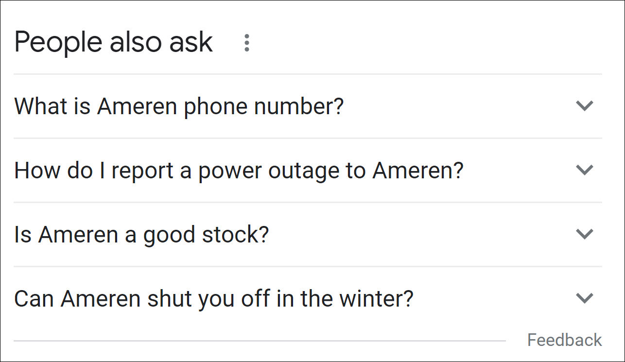
Google’s People Also Ask Box has become an increasingly prominent feature on page one of search. Usually you will see it as a section in the middle of the Google search results page, featuring 3 or 4 questions.
Many companies have noticed that searches about them bring up some bizarre and seemingly contrived questions (“Why is X so bad?”). They wonder if there’s anything that they can do about not only the answers, but the appearance of these types of questions themselves.
The short answer is yes!
But let’s back up for a moment.
People Also Ask: About the Answers
Given that nearly all major companies and CEOs have this feature appear in searches for their name, we’ve recommended in previous articles that brands should own some answers. This means tailoring content, particularly FAQ sections, around real research into what Google typically shows searchers about the company, individual, or related searches. Providing relevant answers would be a way to capture the sources of the PAA for those questions.
In late December, JR Oakes wrote an extremely insightful article in Search Engine Land, about his research on the PAA feature. His analysis explores themes, sources, and sentiment in questions about companies, and the article concludes, worryingly, with the observation that “the PAA results seem dissociated with actual user search interest and more driven by the content that is available online.”
But perhaps therein – with the content – lies opportunity.
PAA Questions, Sliced by Industry
Five Blocks tracks the search results for tens of thousands of keywords on a daily basis. We wondered whether by analyzing our collected data we might be able to provide additional useful guidance on PAA best practices. Are there specific strategies that brands can use to exert more control over the questions and answers section?
We looked at Fortune 500 companies over the first week in December ’20, as searched in New York.
Over the course of the week, most companies had five to seven different questions showing on the first page of their Google results. The Retail industry had the greatest variety of questions, with 7.5 different questions on average per retail company compared to an average of about 6 for all other industries we studied.
The top five topics included in PAA questions account for about 50% of all questions asked across major industries (Financial, Energy, Retail, Technology, Healthcare.)
These topics are:
- What is the company known for / what does it do?
- Who owns the company?
- Is the company / service recommended / better than competitors?
- Company facts and stats
- Help with doing (eg: How can I access my bank account?)
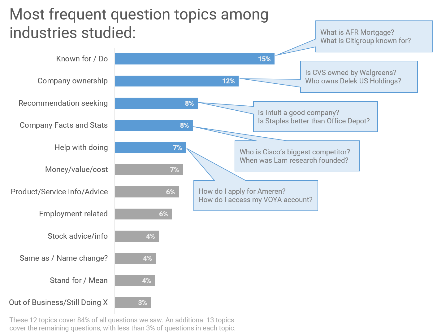
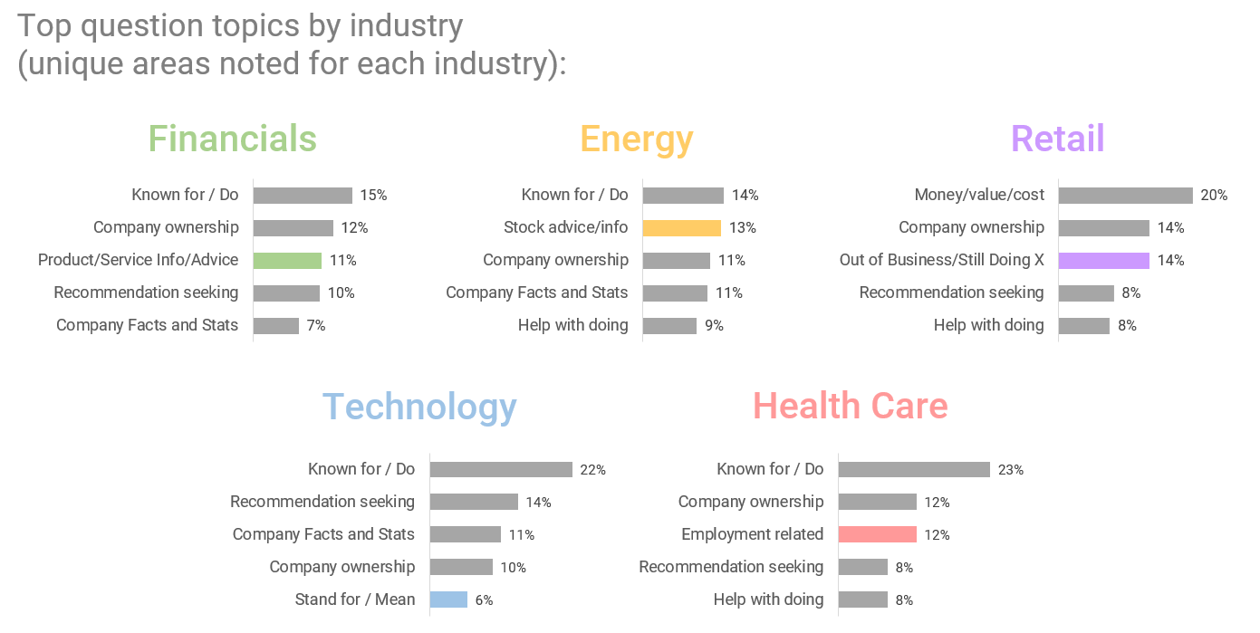
There are also industry-specific questions that we see among the top five.
The Energy sector, which includes companies like American Electric Power and NextEra, has stock questions appearing prominently.
The Technology sector (CDW and Amphenol, for example) elicits questions about what the company name stands for or means (as these names are often “made up words”).
So…what can companies do if unwanted, irrelevant questions pop into the PAA?
As mentioned at the beginning of this article, owning content related to searcher questions is key – since available content online does seem to drive both the questions Google presents and the answers to those questions.
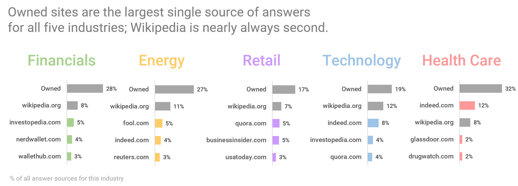
Since owned sites (a company’s corporate website and social media, for example) account for the largest slice of answer sources across industries studied, followed closely by Wikipedia, maximizing the potential of these sources is a good practice for companies.
Also worth noting:
- Owned content sources that end up in the PAA is most prevalent in the Healthcare industry, and least common in Technology and Retail. In these last sectors, Wikipedia is also less popular as an answer source.
- Answers to questions shown for retail companies like Dillard’s come from a larger variety of sites than in other industries. This is likely because there is a larger assortment of questions shown for retailers than for other types of companies.
- Interestingly, Quora is a top answer source for both the Technology and Retail sectors, indicating that Google is willing to trust crowdsourced responses as reliable enough to include as answers to these types of questions.
- Within the Healthcare sector, notable answer sources include both Indeed and Glassdoor, suggesting many of these questions relate to employment.
There are some additional actions that companies can take to “change the conversation”:
- Companies should make a point of knowing what types of questions are asked, not just about them specifically, but about other companies in their industry.
- While the general types of questions by industry are likely to remain stable over time, current and world events can yield opportunities for companies and brands to provide timely answers to relevant new questions as they arise.
- For example, right now we are seeing many questions for retailers asking if they are still around or out of business. This suggests that, during a crisis, retailers may want to remind customers of ways they can do business, even as storefronts are temporarily unavailable. It also means that brands should ask and answer those specific questions explicitly on their website, such as: Yes, we are open 24/7, via our website.
- Although questions related to the legitimacy and trustworthiness of a company are infrequent (we saw these at low levels and only for financial, tech, and retail companies), they can be impactful on a searcher’s perception of a brand. Companies need to regularly monitor the questions Google shows for them and, as mentioned above, leverage content that will negate unfavorable ideas suggested by these questions.
- Note that different searches bring up different questions (“Can I do X” may bring up different questions than “Can you do X”), and that clicking on a question brings up new questions. The best practice is to be aware of the various types of questions and to be sure to have content that asks and answers as many as possible.
Just the Facts: The rise of auto-generated profile sites, and what that means about the direction of search
People like to do quick, basic research before engaging in business. As the go-to place for that research, Google’s page 1 has become a kind of dossier about people and brands. This is why the Knowledge Panel (the summary info that typically appears on the top right part of the Google search results page) has become the gold standard for quick stats of notable individuals. It’s also why the People Also Ask box, with its quick and easy question and answer format, has been pushed front and center by Google. It’s as if searchers have repeatedly said to Google, “Just the facts, Ma’am,” and Google has complied.
Typically, results for top CEOs will include their Wikipedia page, their company’s website, top news stories, and various types of profile sites, which provide a quick snapshot of facts for users.
(Note: Perhaps the most interesting data point for many searchers is CEO salary: we found this in a previous study we did on the People Also Ask box. 22% of all questions appearing for Fortune 100 CEOs relate to their salaries.)
We recently surveyed Google results for Fortune 500 CEOs over three consecutive years (on the same dates) to assess the changing prominence of different kinds of profile sites in their top results.
We found that self-managed profile sites – LinkedIn, Twitter, and Facebook (in addition to Crunchbase, which can be self-managed) – have remained more or less stable in terms of their prevalence on page one for CEOs.
At the same time, third-party profile sites, like Bloomberg, Forbes, Fortune, and Business Roundtable have slightly decreased in page one presence for CEOs over the years. Bloomberg, for example, appeared in page 1 search results for nearly 90% of these CEOs through early 2019; today that’s down to 70%.
The sites that have risen in prominence are auto-generated profile sites, which pull relevant information from multiple websites and databases to create a one-page dossier on executives. These sites, namely Wallmine, Salary, MoneyInc, and MarketScreener, have significantly risen in prominence over the years. Wallmine in particular saw a meteoric rise in 2019 – from appearing for just 1% of CEOs to 65% of them within that same year.
What is interesting about this trend toward automatically created “scraper” sites is that they don’t seem to add a whole lot of value. What are they doing that Google cannot do by itself? Google’s algorithm already tends to prioritize pages and sites that help it answer popular questions and meet the common need for quick facts. Google does this by crawling much of the internet and then displaying the best pages and data points.
When companies do the same type of summarizing, this can be useful to visitors…but only for a time.
Some years ago we saw the same dynamic play out with Answers.com. In order to answer questions people often searched online, that site scraped various authoritative sources and created answer pages – which ranked prominently for tens of thousands of terms. Eventually, though, Google applied a more sophisticated duplicate content filter, demoted Answers.com, found other sites that added more original value, and added its own “dossier” features as discussed above. Answers.com simply wasn’t adding enough value to last long term.
So while right now there are several automatically generated profile websites appearing for many prominent individuals, some of which can actually be managed to some extent (MarketScreener offers an option for a paid profile, for example), we predict that these sites will not retain their prominence long- term.
In our estimation, for a site to remain relevant and prominent in Google search, it needs to add unique value, providing information or an experience that other sites do not…and that Google can’t manage on its own with its own knowledge graph data.
Ideally, sites that want to go the distance should be filling a gap – providing some deeper answers to the popular questions people have, adding images or videos where those are missing to flesh out someone’s persona, or providing information in a language that is not covered.
Google is a reflection of what people want to see, and people seem to want to see a quick and comprehensive picture. Staying valuable will require a heavier lift for content writers and researchers. The robots – the automated content aggregators – will need to find some other, more helpful, work to do.
About the author:
Miriam Hirschman., Research Manager at Five Blocks, is driven by an endless supply of curiosity and a deep background in data analysis as she digs for the interesting stories behind the numbers. Because we believe in data and tools but believe in people even more, she reviews massive volumes of search results, seeking patterns and finding order in the often chaotic world of web search.
People Also Ask: How Brands Can Leverage Google’s Q&A
Google has learned that the”People also ask” (PAA) box format works well to satisfy queries. Google’s goal in PAA and other features is to make page 1 of search so comprehensive that searchers increasingly find their answers right there without having to click to another page.
We drilled down into our data to best advise our clients how this question-and-answer trend could help them reach their stakeholders more effectively. What we discovered enabled our CEO, Sam Michelson, to come up with some concrete suggestions for companies and executives, which he recently published in Forbes.
Here’s a summary of what we found out:
Here’s Sam’s advice for companies and CEOs, as originally published in Forbes:
Own some answers.
Owned sites are often a source of answers to common questions. Companies, following a best practices optimization strategy for their websites, can help those become a trusted source of leading information on the results page. This would include, for example, a robust FAQ section based on real research into what people are asking and providing answers in the area of your company’s expertise to capture the PAA for that question cluster.
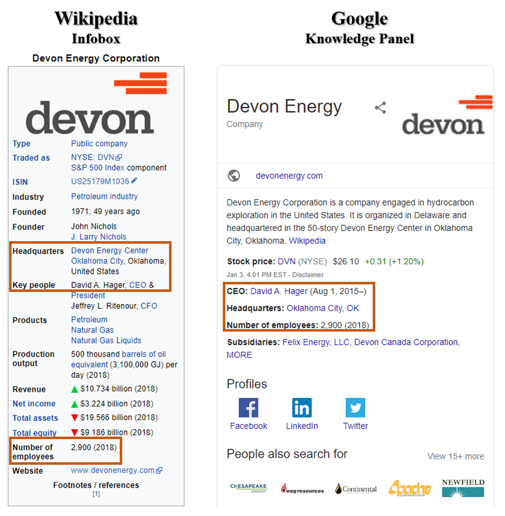
Develop a presence on Wikipedia.
Google prefers Wikipedia pages in its results. It also relies heavily on Wikipedia for both PAA box information as well as the Knowledge Panel, the box on the top right of search which summarizes information about a searched brand or individual. It is therefore essential to work with the Wikipedia community to ensure your company (and CEO’s) Wikipedia pages are updated and accurate.
Maintain structured data.
The above findings also underscore the importance of maintaining structured, up-to-date data about yourself and your company online (i.e., Google My Business, Schema, Wikidata), as this information echoes throughout Google’s page one, especially for CEOs.
Target your earned media.
Since we know that the PAA box sources its answers heavily from certain business sites, it would be worthwhile, when working with PR companies, to try to place stories specifically on those sites.
Assessing what questions people ask, basing some of your content around those, and leading readers to the information you most want them to discover will be meeting your market where they are instead of simply telling them what you want to say.
With so much of the territory unchartable, companies taking control of what they can is essential. Using all available platforms to both ask and answer searcher questions, and taking them down a path that both satisfies their search and helps the company tell its story, is a win-win.
The Wikipedia Index: The Edits that Matter
We’ve noted before how important a Wikipedia page is: 98% of Fortune 500 companies have their Wikipedia page ranking in their first page of Google results. Previously (here and here), we examined the sheer volume of edits made to Fortune 500 companies’ Wikipedia pages.
But what is the nature of these edits? What kinds of changes are being made by Wikipedia’s many editors, and which ones should you care about most?
It turns out that the vast majority of all edits to Fortune 500 company pages are just one of four types – text, infobox, links, and references. Text and infobox changes are the most crucial.
Edits to text include changes, additions, and deletions of any text in the body of the article. This content is obviously what readers come to a Wikipedia page to see; what many don’t realize is that it’s also where Google pulls pieces of its search results.
Therefore, changes to text on a Wikipedia page often become incorporated into both the search page results and the knowledge panel (Google’s data summary box on the right side of the page).
In some cases, this happens as soon as an edit is made, creating an opportunity for vandalized text in Wikipedia to show directly in Google. We wrote about that here.
Another key component of a Wikipedia article for a company is the infobox. This is the box on the right side of a Wikipedia article that gives a synopsis of key points about the company. Critically, Google often pulls points directly from the infobox into its own knowledge panel.
Don’t Panic, But Do Pay Attention
Google and Wikipedia are two of the most visited websites in the world. When people search Google for information about a person or company, their answer on Google’s search results page often comes directly from Wikipedia.
Whether a company’s page is edited with malicious intent – vandalized – or simply updated with incorrect information, the strong connection between Google and Wikipedia means that edits within Wikipedia have ramifications for a company beyond just Wikipedia.
When someone edits the body of a Wikipedia article, that change may be picked up by Google right away, or it can take a few days. This sometimes allows other editors to undo or remove vandalized text before it ever makes it to Google. However, when an edit is in the first sentence of the Wikipedia article, Google picks up the change immediately, making such edits highly risky for the company or person. This can be the case also for edits made to the infobox.
Companies, brands, and individuals with a Wikipedia article about them need to be vigilant about continuously monitoring their Wikipedia pages for any edits. That way, they can be on top of any changes to these pages that don’t convey an accurate picture and, most importantly, take steps to remove these changes when necessary.
So, what happens when they Google you?
What searchers think about a CEO’s search results
As an Intelligent Digital Reputation Management company, we are constantly doing research to understand how Google presents brands and executives in search. We also research how searchers utilize search engines to make decisions.
In August, we asked 672 US adults about their likelihood of doing business with Signiphy (a fictitious company) based on a provided set of search results – in visual form (see composite example below ) – for the (fictitious) CEO, Dave Miller.
Respondents were asked to imagine they were already considering doing business with the company and, as a next step, had decided to Google the CEO. Each participant was shown one of several variants of the search results page and was then asked to answer some questions about the page they saw.
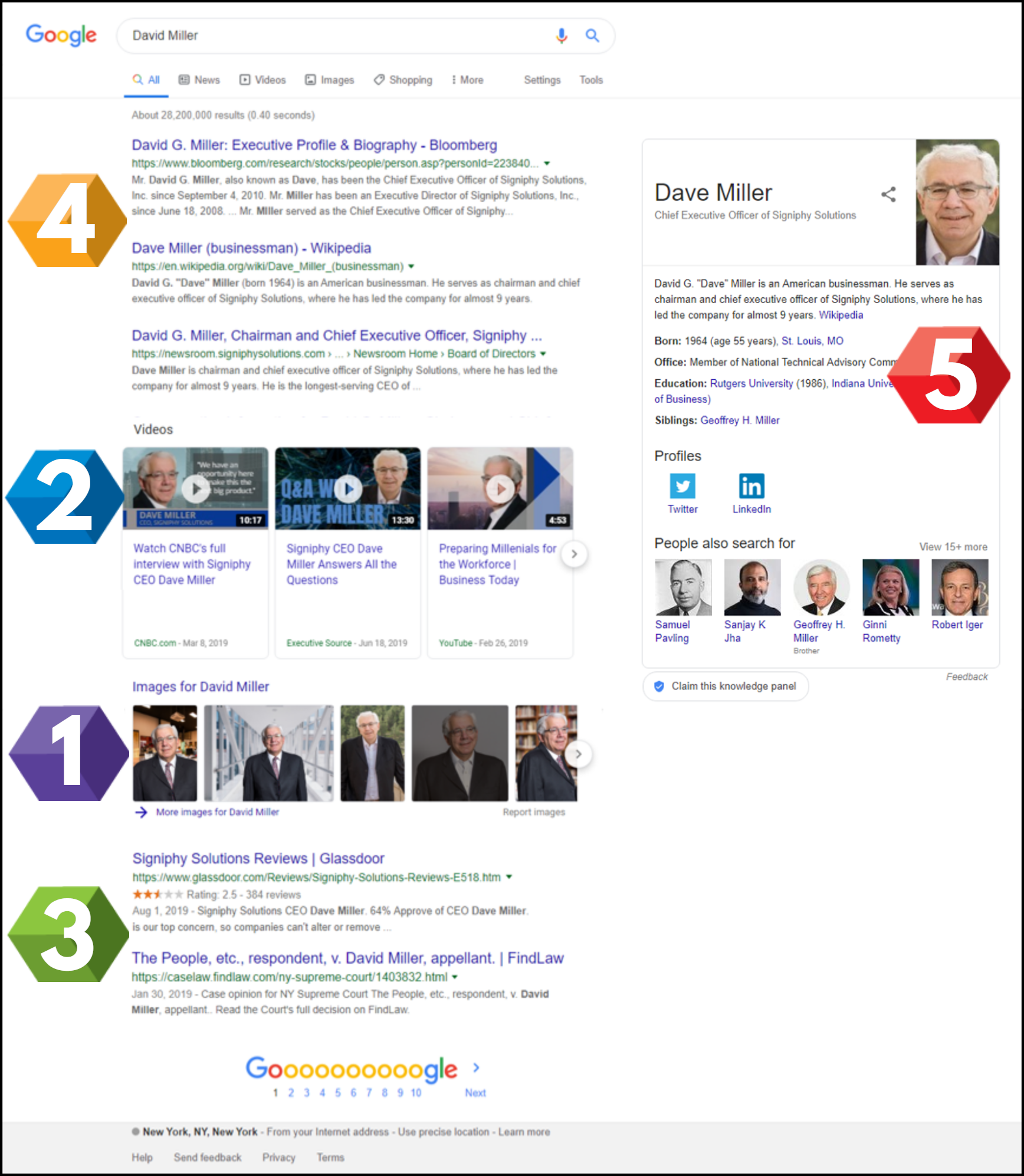
Here’s what we found:
1 IMAGE BOX
This is intuitive – but it was borne out clearly in our research: Images on a search page help paint a picture in the searcher’s mind, more easily than any block of text, and affect how the searcher feels about the person they are searching.
We used images that depicted a CEO in a suit, smiling. He was evaluated as friendly and influential, and – notably – drove 80% more people to say they’d like him as a business partner compared to those who did not see the version with images. The majority of people, however, said they needed more information to decide.
Takeaway: Given how salient images are in searchers’ minds, well curated images can be a key factor in cultivating a favorable first impression.
2 VIDEO BOX
Video boxes take the impact of the visuals to another level. Like the image box, the video box in our study boosted impressions of the CEO as influential and friendly.
More than that, though, having a video box with favorable content helps solidify appeal of the subject for the searcher. Nearly 60% of people who saw the version with the video box indicated an increased likelihood to do business with the CEO’s company. Presence of the videos also boosted people’s sense that they had enough information to make a decision about doing business.
Takeaway: Videos that portray the CEO as a thought leader, hosted on known media (such as Forbes)– or even sites that appear to confer authority such as CNBC – are key in shaping searchers’ impressions of the CEO.
3 RATING SITES
Glassdoor is a site that allows current and former employees to rate their employer and its CEO. The site often appears on page one of Google search and is always shown with rating stars. Consequently, Glassdoor results are eye-catching and easier to quickly interpret compared to an all-text result.
The Glassdoor result in our research was shown with a mediocre 2.5 star rating. This led people who saw this result to be less likely to do business with the company, more so, in fact, than those who saw an all-text negative result about a pending lawsuit against the CEO.
People are used to seeing rating stars in searches for products and know to stay away when a product has few stars. That intuition transfers when rating stars are shown for a CEO, making Glassdoor an important result to watch.
Takeaway: If your brand has results with star ratings – Yelp, Glassdoor, or others – it is important to manage these and ensure that the star ratings are high – or alternatively that these results are not appearing prominently. Either way, brands need strategies aimed at managing these types of sites.
4 AUTHORITATIVE SITES
Bloomberg and Wikipedia are consistently among the most frequent sites to appear prominently in search results for CEOs. They typically appear toward the top of the page.
In our research, these two sites were the most frequently mentioned (in open ended replies) as the first places the searcher would click for more information.
Takeaway: Bloomberg and Wikipedia are deemed authoritative and trustworthy. This makes them an important component of a CEO’s digital presence.
5 KNOWLEDGE PANEL
As mentioned above, searchers’ attention will inevitably drift toward the visual, easily processed information on a search page. Even so, it is important to curate the text-only components of one’s search results. (This is especially true when there are fewer attention getting visual elements, where searchers are likely to take the time to read the text-based results.)
Our test pages mentioned both in the Wikipedia result and in the corporate bio that the CEO had been in that position for nine years. That information was duplicated in the knowledge panel blurb, which uses the first sentence from the subject’s Wikipedia page. People deemed that information useful and likely noticed it because it appeared in multiple places.
Takeaway: Curating search results by making sure key information appears in multiple authoritative online sources ensures that searchers will see desired information about the company or individual they are searching.
The Wikipedia Index: Edits to the Fortune 500
Wikipedia editors worldwide make 1 million edits every week. How many of these are edits to pages of major companies? Does it vary by industry? We found out for you:
How Often Do Fortune 500 Companies Get Edited on Wikipedia? Insights from the Wikipedia Index
In today’s digital world, your brand’s Wikipedia page is often the first stop for journalists, investors, and curious consumers. But how often do these pages change—and who’s keeping track?
According to data from WikiAlerts by Five Blocks, Wikipedia editors around the globe make over 1 million edits every week. Among those changes, Wikipedia articles about Fortune 500 companies in major industries are updated multiple times per week, reflecting the dynamic nature of corporate visibility and reputation management.
Wikipedia Edits by Industry: Who Gets Edited the Most?
Here’s how frequently Wikipedia pages for top companies in different sectors are changed every week:
📺 Media – 7 Edits per Week
Media companies lead the pack with an average of 7 updates per week. High-profile names like Netflix, 21st Century Fox, Disney, Viacom, and CBS often make headlines, driving frequent edits.
✈️ Transportation – 4 Edits per Week
The transportation sector, including giants like Delta Air Lines, American Airlines, Southwest Airlines, JetBlue, and Harley Davidson, sees about 4 Wikipedia edits weekly.
📞 Telecom – 4 Edits per Week
With major players such as AT&T, Verizon, Comcast, CenturyLink, and DISH Network, telecom companies also experience 4 edits per week, mirroring the fast-paced nature of the industry.
🛒 Food & Drug Stores – 3 Edits per Week
Brands like Rite Aid, Kroger, Albertsons, Publix, and Walgreens get about 3 Wikipedia updates weekly, reflecting ongoing consumer and industry developments.
💻 Technology – 3 Edits per Week
Tech powerhouses like Facebook, Apple, IBM, Dell, and Alphabet also see around 3 weekly updates, underscoring how frequently digital innovation influences public-facing content.
Why Wikipedia Edits Matter for Your Brand
Wikipedia often ranks among the top results in Google searches. A change on your Wikipedia page—whether factual, outdated, or reputation-altering—can influence perception at a massive scale. That’s why platforms like WikiAlerts are essential for monitoring brand mentions and edits in real-time.
Stay Informed, Stay Ahead
Want to know when your company or brand is mentioned or edited on Wikipedia? Get alerted at: wikialerts.fiveblocks.com

There’s no doubt about it: Monitoring Wikipedia changes to corporate or executive Wikipedia pages is an essential component of reputation management.
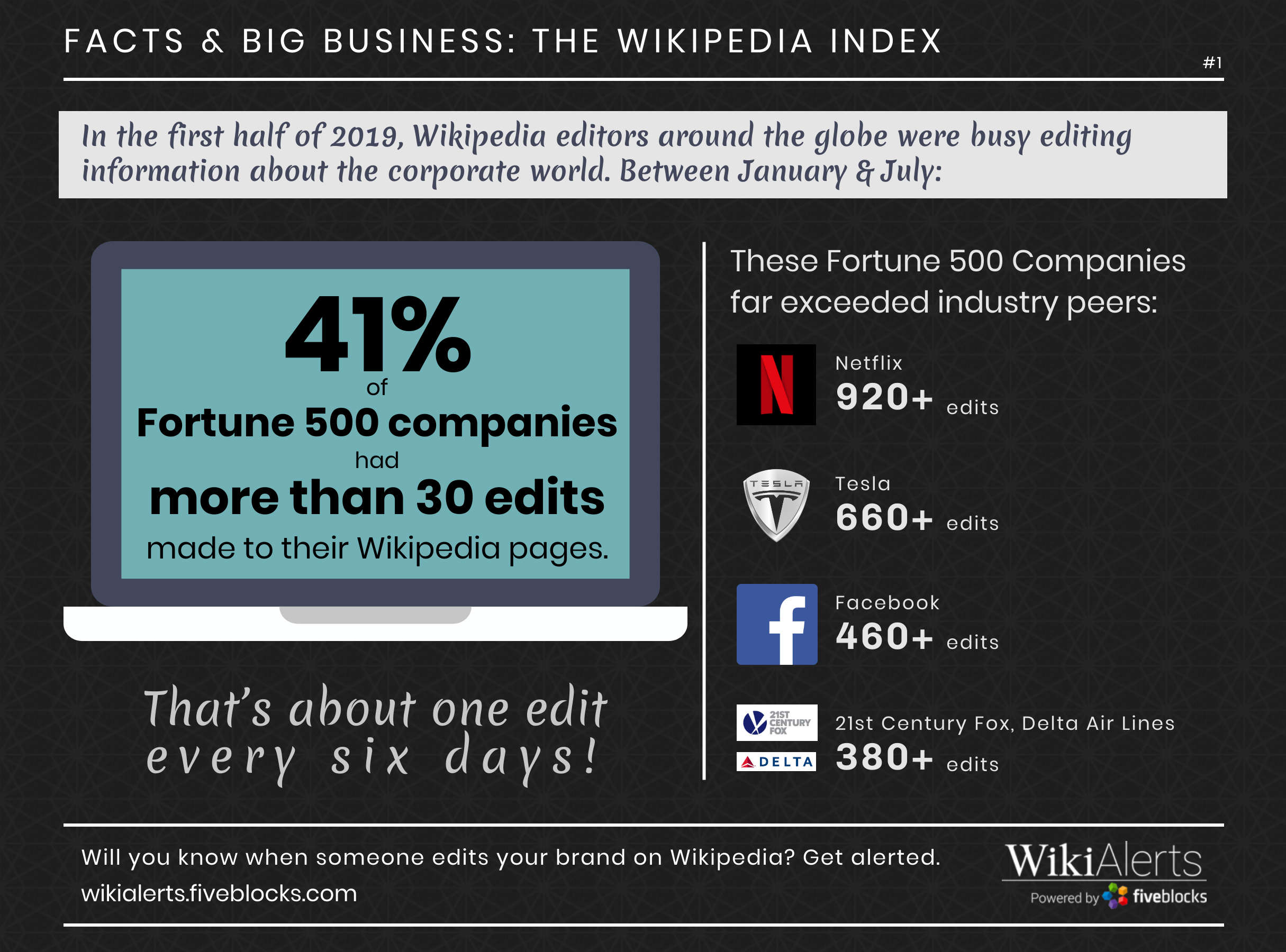
The Wikipedia Index: Facts and Big Business
We’ve said it before, but it’s worth saying again: Monitoring changes to corporate or executive Wikipedia pages is an essential component of reputation management.
As we’ve noted previously on this blog, Wikipedia is the 5th most visited website in the world, with 80 million registered users and 200,000 editors. Wikipedia has changed the way we seek out information and determine its accuracy, with two thirds of US adults saying that they sometimes or always trust what they read on Wikipedia, according to our recent research — which also found that half of Fortune 500 CEOs (and 94% of companies) have an entry that ranks on page one of Google for searches of their names. Wikipedia is a key component of online reputation for notable organizations and individuals.
With that in mind, look how frequently major brands have their pages edited by Wikipedia’s many editors:
WikiAlerts™ by Five Blocks facilitates monitoring by sending real-time email alerts when edits are made to tracked Wikipedia pages.
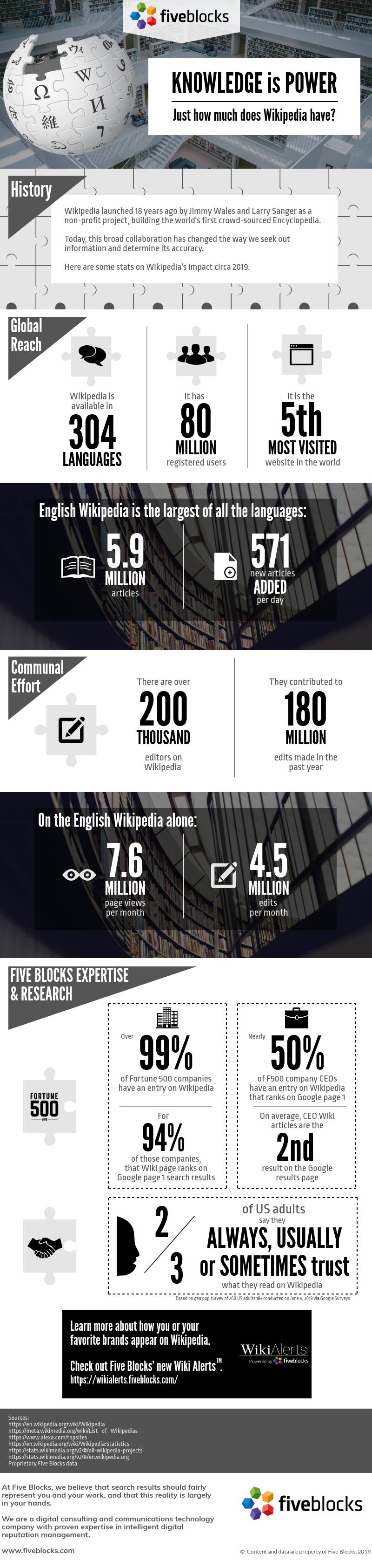
Knowledge is Power: Wikipedia Fact Sheet
The 5th most visited website in the world has changed the way we seek out information, and the way we think about knowledge as a collaborative effort. If you are a CEO with a Wikipedia page, that page will likely be the second result on a Google search for your name.
Here’s a 2019 look at Wikipedia:
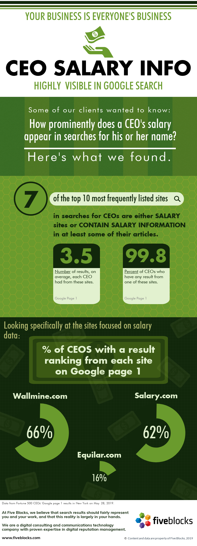
CEO Salary: Highly Visible in Search
Some of our clients wondered: How prominently does a CEO’s salary appear in searches for his or her name? Turns out, fairly prominently.
Here’s what we found:
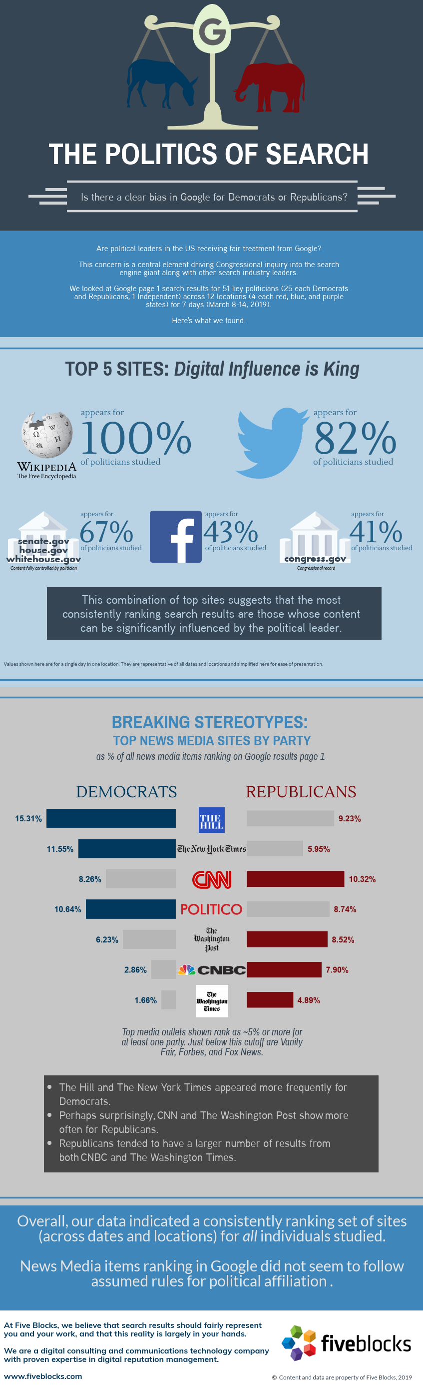
The Politics of Search
Are political leaders in the US on both sides of the aisle receiving fair treatment from Google?
This concern is a central element driving Congressional inquiry into the search engine giant along with other search industry leaders.
We looked at Google page 1 search results for 51 key politicians (25 each Democrats and Republicans, 1 Independent) polled across 12 locations (4 each red, blue, and purple states) for 7 days (March 8-14, 2019).
Below is what we found.
In a nutshell: News Media items ranking in Google did not seem to follow assumed rules for political affiliation.
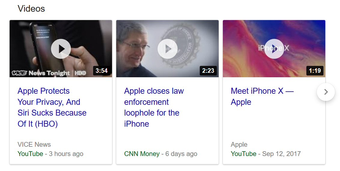
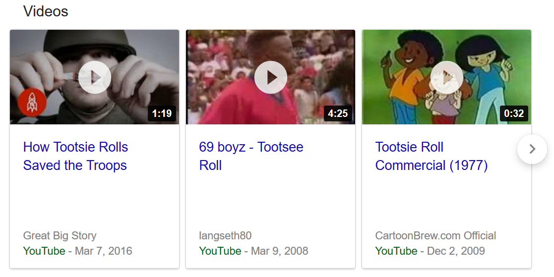
Google is boosting video with new video carousels
Over the past few days, we have begun to see a new and powerful feature in Google search results.
Instead of showing video results as before, they are now presented in a video carousel. This means that searchers see three videos in a box, with the ability to scroll and see additional videos. (Note that Bing rolled out a similar feature weeks ago!)
The following carousel, for example, now appears in searches for “Apple”:
This is the one appearing for “tootsie rolls”:
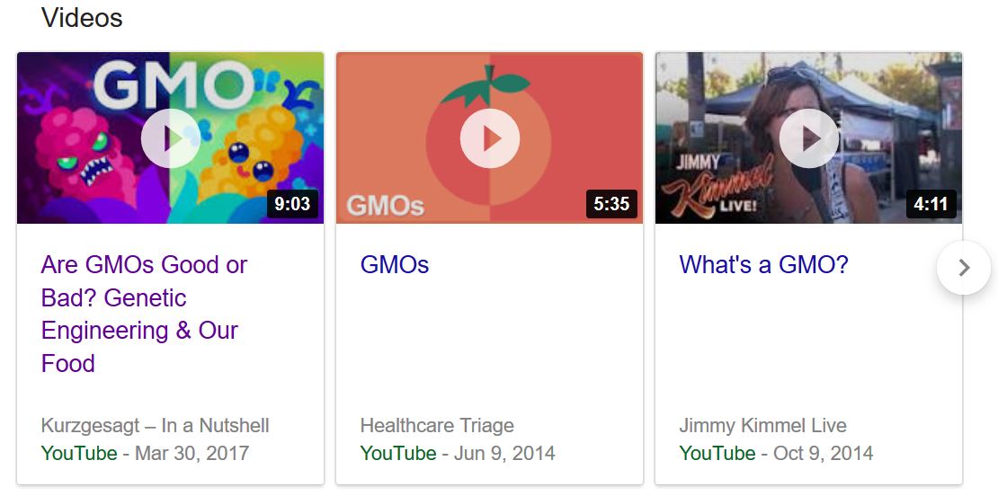
These video boxes also impact how people see important topics like GMOs:
Interestingly, this new video box doesn’t just appear for topics where video is an obvious result; we are also seeing video carousels on page 1 for many of our clients. For example, we see it for Fortune 500 companies and their CEOs, hedge funds and their managers, hospitality brands, financial institutions, and high net worth individuals.
The videos in the carousel are sourced from sites like YouTube as well as the Wall Street Journal, CNBC, and Yahoo Finance. In many cases, the videos are being sourced from the brand’s official website as well.
Google has just given brands the equivalent of $1,000s in free video advertising – if they know how to leverage this new feature!
Some thoughts on what this means:
- With more clicks going to video than before, brands that weren’t previously harnessing the power of video will want to consider an appropriate strategy.
- Brands that have preferred video content should use best practices to ensure their preferred videos appear prominently. This is likely to require an ongoing effort, as the algorithm governing the choice of videos is new – not the one that determines the order in Google’s video search.
- This is a reminder to brands to ensure that their onsite video content is being properly crawled, cached, and indexed.
- The thumbnail image of a brand’s videos is now part of the first page of results. This means that it is time for brands to revisit these and to make them optimal for branding and to attract clicks.
There are still some kinks for Google to iron out. In a few cases, we saw the same video appear multiple times in the carousel, sourced from different sites. We also noted that Google hasn’t yet connected the video carousel’s content to related brands. (For example, for Target, which has an active YouTube channel, none of the six videos shown were related to the brand.)
Overall, we believe that this feature, harnessed optimally, can be valuable for brands seeking to expose visitors to engaging content. Our goal is to help brands tell their story online and video is often the best way to do just that.
If your brand or executives could benefit from having a better control of their online image, we are happy to discuss how we may be able to help.
It Pays to Be Wordy…And It’s Free!
Twitter jumped into the 2017 holiday season with something new for its 330 million users: the gift of more gab. As of early November, it officially doubled the character limit for a tweet, jumping from 140 to 280 characters.
Reactions so far are split on whether this is a good thing, with some already mourning the loss of creativity forced by the 140-character constraint. However, there is a major hidden benefit to Twitter’s new world of wordy: the way it affects your search results page.
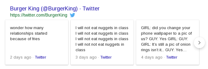
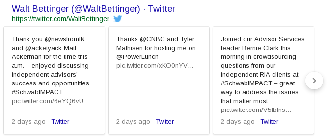
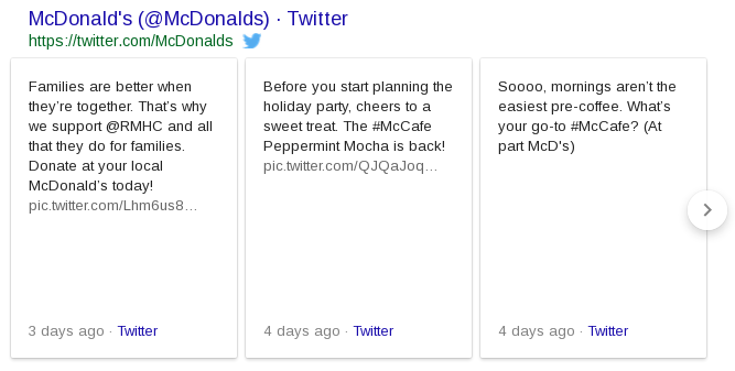
Since August 2015, when someone Googles a term associated with a Twitter account, the search results have included a dedicated space for actual tweets from that account. That’s a win for companies, brands, and people who care about their online presence. It means their voice is right there on the search results page, in a section whose contents they completely control.
With Twitter’s newly doubled character count, we wondered if Google would come along for the ride. Would the Twitter box on the search page double in size? Or would it just cut off the tweet after 140 characters?
The answer? For Twitter boxes featuring the wordier 280-character tweets, the actual box has grown to accommodate the greater length.
This is an incredible branding gift from Twitter and Google, offering even more space in the search results for a brand (or company, or individual) to control and to tell their own story. This is the kind of space brands pay money to have on the search page.
Brands should welcome this gift with open keyboards. They have learned how to be creative in 140 characters; now it’s time to embrace the new challenge to be engaging, yet still pithy, in 280.
What’s more, companies can reap the benefits of a longer Twitter box on the search page without being needlessly wordy all the time. The box works as a carousel, allowing the searcher to scroll horizontally through a few recent tweets, beyond just the first three showing. We discovered that if any of the tweets in the box – even the ones not initially visible – are longer, it lengthens the whole box.
In this new era of Twitter 280, brands have the opportunity to offer deeper thoughts, or even just thoughts that are longer winded. That’s their choice. But now it pays to be wordy – without even having to pay.
Google Serves Up a Fail for Waffle House
I’m not from the South and have never been to a Waffle House. So, without ever having given it too much thought, I could only imagine that eating there is probably fairly similar to any other fast food experience. Today, though, I had occasion to search for Waffle House on Google. Based on their search results, with all due respect to customers of Waffle House, I have learned that Waffle House seems to be a magnet for the lowest class of society. Highlights from their search page include:
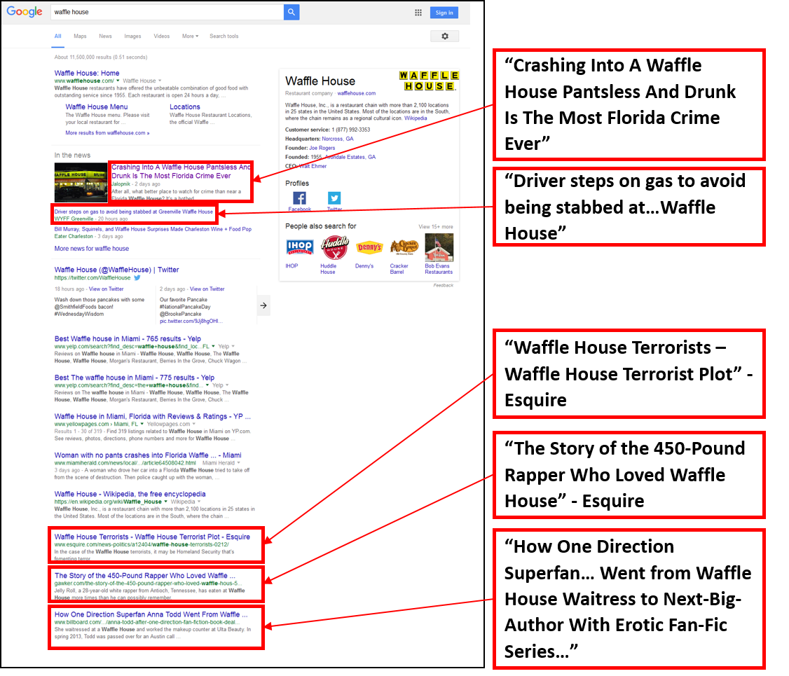
As an SEO researcher, I am particularly intrigued by the in-depth articles Google’s algorithm selected for inclusion here. In-depth articles often appear in search results for a known entity, such as a person, company, brand, or concept. They appear as a group of three articles and are typically long form journalistic coverage of the searched term. Often, their coverage has a negative slant. For example, one of Apple’s in-depth articles is “iPhone Killer: The Secret History of the Apple Watch.” For Uber, we find “The Inside Story of Uber’s Radical Rebranding.”
But these in-depth articles aren’t about Waffle House at all. They are stories about people, some crazy people, whose lives happened to intersect with Waffle House. Is that really what people searching for Waffle House are interested in finding? More than anything, they create a highly unfavorable impression of Waffle House, even though these stories have little to do with the brand itself.
Yes, these articles all mention Waffle House and yes, they are all long form journalistic coverage. In that sense, Google’s algorithm got it right. But I think nature abhors a vacuum and Google abhors one even more. In the absence of any other in-depth article-worthy coverage of Waffle House itself – positive or negative – Google’s algorithm scraped the bottom of the barrel and came up with these.
Ultimately this is one big fail for Google’s algorithm that leads to an even bigger fail for the Waffle House brand. Google is probably the best place to go when you want to size up an individual, company or brand. You are quickly exposed to a variety of sources and types of information: corporate website, social media, news, YouTube, Wikipedia etc. But when Google gets it wrong – as they do in this Waffle House example – the cost can be very high for the brand, with stakeholders getting a negative and undeserved impression of the brand.
Wikipedia Page Visits – Have You Measured Your Mobile Visits Lately?
A good way to gauge the popularity of a topic is to look at traffic to that topic’s Wikipedia page. Traffic to the page is a quantifiable measure that is easily understood and easily compared across topics.
This is particularly interesting for a company or famous person. When a CEO says or does something notable or a company experiences a crisis, Wikipedia article traffic reveals a spike in interest.
Each Wikipedia article includes a link to view these traffic statistics, although the link itself is somewhat difficult to find. For this reason, we at Five Blocks bring this valuable data to the forefront and share it with our clients. We include it in our reporting and we feature a graph of this data on our automated monitoring tool.
On January 21, 2016, the Wikipedia traffic statistics page stopped updating. It turned out this was the beginning of a migration to a new Wiki traffic measurement site. By the first week in February, the reporting was back from a new source. It improved on the old source, by allowing for viewing statistics for flexible date ranges. It even allowed a user to slice the data by traffic source (desktop vs. mobile). But that’s when we realized something was off. The traffic numbers from this tool were quite a bit higher than they were on the old one.
A bit of checking revealed the answer: the old tool was only reporting article visits from people using a computer, while the new tool included computer users and those on mobile devices. We were happy to learn that the reporting from the new data source was more comprehensive. But this had significant implications for our reporting until that point. Reporting from the old source actually understated the actual number of visitors to the wiki article.
For example, Mark Zuckerberg’s traffic as reported on the old tool would look like this:
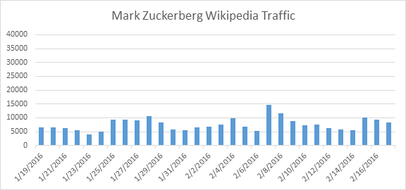
This shows average daily traffic around 7700 visits with a peak on Feb. 7.
But the more complete picture includes mobile traffic as well. It looks like this:
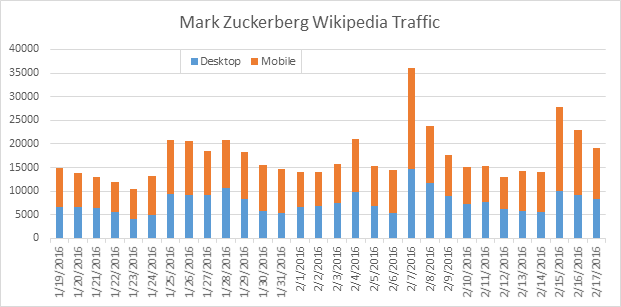
Average daily visits are actually 17,300. And the spike on Feb. 7 is now quite pronounced. (That’s when Zuckerberg wished the world a Happy Lunar New Year in Mandarin and announced his baby daughter’s Chinese name.)
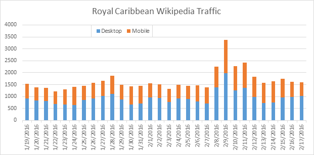
Ignoring the mobile traffic here omits over half the visits to the page, totally under-representing actual interest in Mark Zuckerberg. Note a similar pattern with Royal Caribbean, which experienced its own crisis on Feb. 9 with news of its ship getting damaged in rough seas.
With the new data source only retroactive to August 2015, any historical data (from the old source) will require a big asterisk to remind us that we are not seeing the full picture. While the old data will still be useful to search for trends, patterns, and spikes in Wiki article views, it comes with the important caveat that the numbers themselves fall short of actual traffic. Certainly, new data should not be compared with old data given the different basis for measurement.
Obviously, the proportion of mobile traffic to a Wiki article will vary depending on how relevant that topic is to a mobile audience. But this point is clear: mobile traffic to wiki is significant. And omitting it means a significant under-representation of the popular interest in a topic, particularly during a reputation crisis.
In-Depth Articles…but Shallow Market Penetration?
Followers of this blog know that we have been eyeing for months the phenomenon of in-depth articles and their potential impact on reputations of companies and individuals online. First, we watched their appearance last August, then their tentative migration up the results page from their original placement at the bottom and now their wild disappearing and reappearing act.
Through the beginning of this year, things were pretty steady with about 10% of the companies in the Fortune 500 showing results that included in-depth articles. Just at the end of February, however, the fluctuations began, with nearly 20 companies losing their in-depth articles one day, and then some bouncing around.
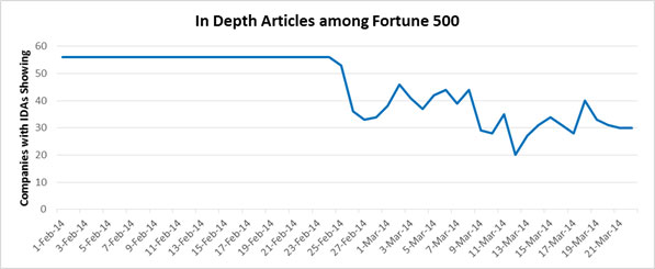
At the lowest point, nearing mid-March, only 20 companies had in-depth articles, a drop-off of 64% from the 56 that began February!
For now, it looks like Google’s in-depth article experiment is still in progress and it remains unclear where this moving target will land. And while we cannot claim to be in Google’s head to explain what’s going on, we can hazard a guess.
On the theory that Google’s aim is to make search results ever more useful for searchers, we have to wonder how useful these in-depth articles have been. Unlike news results, which can change daily, reflecting changes in the world, or profiles and background pieces (e.g. Wikipedia) useful for reference, we suggest that in-depth articles – lengthy and often with a slant – may not be seeing repeat visits. Moreover, their length makes them time consuming to read, making it difficult for the average searcher to get in, get the gist, and get on to something else.
For all the companies with unfavorable in-depth articles, a shift away from them would be a good turn. Ultimately, though, whether this experimentation means in-depth articles are approaching their sunset – or if something else is on the horizon – is anyone’s guess. Meanwhile, we will continue to monitor the course of Google’s current lab work.
In-Depth Articles Rising From the Depths
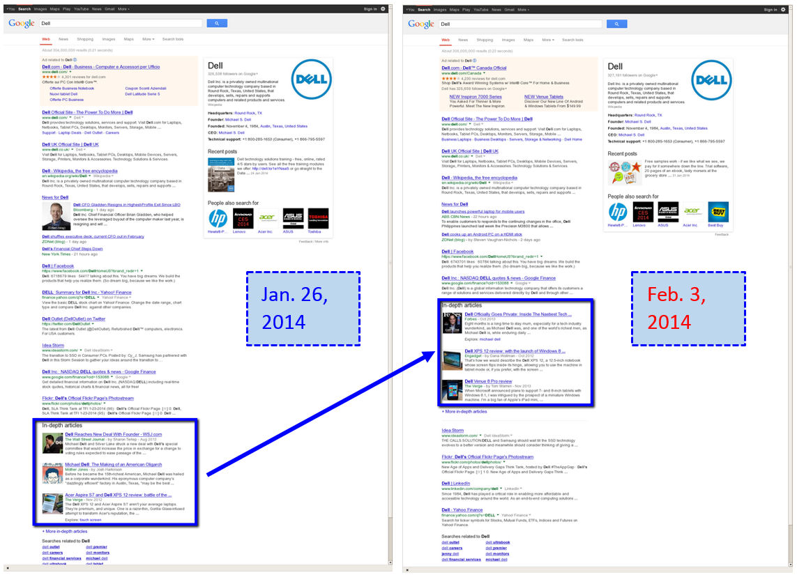
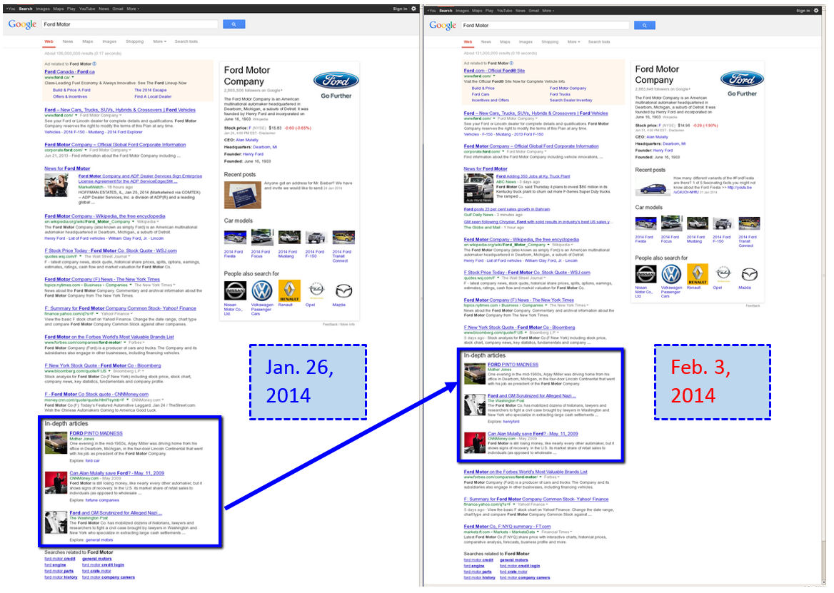
It looks as though Google just couldn’t wait to celebrate the six month anniversary of one of its newest search results feature, In-Depth Articles. In the last few days, there has been a subtle but important change regarding the placement of in-depth articles in the Google search results.
Rather than appearing as the bottommost group of results as they have since their introduction on August 7th last year, in-depth articles for a handful of companies (including Dell and Ford, shown below) have been promoted, with some of the organic results now appearing below them.
That’s the subtle part. But why is that important?
The in-depth article box is Google’s way of highlighting long-form journalism and ensuring articles of this type persist in first page results for the increasing list of companies for which they appear.
While the depth of their content makes them relevant long beyond the always-changing news landscape, by and large they are unfavorable portrayals of the companies they’re about. As digital branding consultants, Five Blocks has been closely following in-depth articles for the past six months. For our clients, as well as many of their competitors, in-depth articles are a force to be reckoned with, specifically because they (and their mostly unflattering content) stick around even as other search results on the page come and go.
This latest move by Google to start inching in-depth articles up the page, placing them above some of the organic results, suggests even greater popularity for this type of search result. It also underscores the importance of careful strategic planning to ensure a favorable online brand image. Like it or not, Google’s inclusion and promotion of the in-depth articles means they are an integral part of a brand’s online story. It’s no longer enough to tell your story on your own sites, be socially active, and make the news. The brand story will need to be told by engaging magazines and other long form publications to utilize the opportunity afforded by in-depth articles rather than becoming a victim of them.
PR professionals and corporate communications specialists know that these stories usually take several months to write and photograph, so the path involves planting seeds ahead of time and being willing to own up to missteps as well as successes. For more about the potential impact of in-depth articles on PR and Digital Marketing firms, click here. It follows that the long form article will not be 100 percent positive. Companies need to take a strategic approach and realize that if they warrant one long form article, there will likely be more to follow. Brands should look for opportunities to proactively pitch and place these coveted long form articles with the goal of ‘owning’ at least part of the in-depth conversation about their brand.