How Deep is Google’s Love?: Where the In-Depth Articles have Gone (and What it Means for You)
![]()
Recently, Google appears to have made a significant change to its search results page that eliminated several in-depth articles for many clients. We’ve taken a deeper dive into this development to see what it could mean for brands and high-profile individuals, and the PR professionals who work with them.
As you know, when searching for a brand or an individual, the Google search results page presents a variety of relevant content pieces and types of media to satisfy the query. Often this means a company’s own webpage will appear at the top, followed by third-party content such as Wikipedia and news sources. There may also be social media results (if an individual or brand actively maintains these platforms), along with image results or video content.
Several years ago, Google introduced a section within top search results they called “in-depth articles”. These results looked very similar to other search results, but came from longform media outlets like Variety, Rolling Stone, or The New York Times Magazine. Often, they were a seminal article about the brand in question – articles that may have been placed by their PR teams.
Including these articles on the top results page seems to have been Google’s way of ensuring that a greater variety (and deeper) content would appear in this prime spot. Their inclusion, and the actual articles that appeared within that section, were governed by a different set of algorithms than most search results.
Recently, this section disappeared from all search pages for brands and executives. This happened without any announcement or acknowledgment on the part of Google. It is important to note that in-depth articles for many brands and individuals contained negative content. At the same time, it was the place where particularly engaging longform journalism made its way onto the prime real estate of Google page 1 for a brand.
The ramifications of Google’s elimination of this section are yet to be seen, and their motivation can only be assumed to be “less intervention” following high profile criticism of potential bias in their algorithms.
A whole host of interesting questions arise from Google’s move: What is the corporate (and civic) responsibility of those who hold the world’s data in their hands? Are there cases for intervention? Who decides what those are?
It is interesting to note that alongside this mysterious disappearance, a recent Five Blocks study of CEO search results found there are far fewer news sites (sites such as CNN, CNBC, and others) on the first couple of pages of searches for a CEO compared to a year ago. In addition, those pages feature many more profile sites, where one would find more dry facts (often created by the brand), and less news.
This marked difference in the presence of news within the organic results over the course of the past year, alongside the recent removal of the in-depth article section, means that page 1 of search for brands and individuals will contain far more“owned” content – i.e.: information they control.
For some brands this would appear to be a positive turn of events, but for many this trend means they will not automatically have great media pieces (which they often earned by being genuinely great) appear prominently in searches. It means they will need to work harder to deliberately ensure that the best third-party media does in fact place highly within their profile. Savvy communications teams will find ways to enhance their brands’ online presence within these brave new parameters.
— Sam Michelson, with Sara K. Eisen
It Pays to Be Wordy…And It’s Free!
Twitter jumped into the 2017 holiday season with something new for its 330 million users: the gift of more gab. As of early November, it officially doubled the character limit for a tweet, jumping from 140 to 280 characters.
Reactions so far are split on whether this is a good thing, with some already mourning the loss of creativity forced by the 140-character constraint. However, there is a major hidden benefit to Twitter’s new world of wordy: the way it affects your search results page.
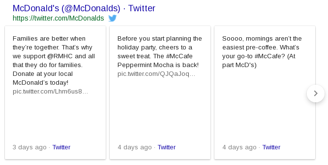
Since August 2015, when someone Googles a term associated with a Twitter account, the search results have included a dedicated space for actual tweets from that account. That’s a win for companies, brands, and people who care about their online presence. It means their voice is right there on the search results page, in a section whose contents they completely control.
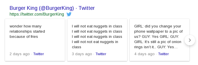
With Twitter’s newly doubled character count, we wondered if Google would come along for the ride. Would the Twitter box on the search page double in size? Or would it just cut off the tweet after 140 characters?
The answer? For Twitter boxes featuring the wordier 280-character tweets, the actual box has grown to accommodate the greater length.
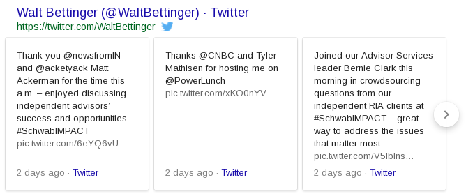
This is an incredible branding gift from Twitter and Google, offering even more space in the search results for a brand (or company, or individual) to control and to tell their own story. This is the kind of space brands pay money to have on the search page.
Brands should welcome this gift with open keyboards. They have learned how to be creative in 140 characters; now it’s time to embrace the new challenge to be engaging, yet still pithy, in 280.
What’s more, companies can reap the benefits of a longer Twitter box on the search page without being needlessly wordy all the time. The box works as a carousel, allowing the searcher to scroll horizontally through a few recent tweets, beyond just the first three showing. We discovered that if any of the tweets in the box – even the ones not initially visible – are longer, it lengthens the whole box.
In this new era of Twitter 280, brands have the opportunity to offer deeper thoughts, or even just thoughts that are longer winded. That’s their choice. But now it pays to be wordy – without even having to pay.
So, You’re Working on Digital Brand Alignment for a COUNTRY!
We have had opportunities to work with governments, NGO’s and organizations of all types.
Before we can advise a client on the steps they should be taking, we need to understand the context. When working with a country, it is important to ascertain what results are normal for a country.
Clients will usually say something like, “CIA Fact Book?! Why is the entry for CIA Fact Book coming up so high for us? Does Google consider our (banana?) republic a terrorist state?”
To answer these and other questions we start by looking at the expected results for countries.
Below is a chart for Dec 17, 2012 showing the most frequently appearing domains for countries searched in Google. This table considers the first page of Google as seen in the US only. Note that results in any specific location may vary, so that searching in Google.fr (France) would be expected to yield more sites that pertain to that location.
Numbers on the chart indicate the number of countries displaying this domain in their first page Google results.
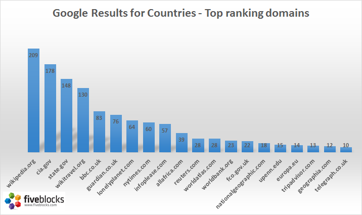
It is interesting to note that cia.gov and state.gov dominate the results along with the ubiquitous Wikipedia. If you are responsible for the branding of a country, this table serves as some initial context. Any site here that also appears for your country should not be a shock.
One of the surprises for me was a site called infoplease.com (by Pearson Education) which ranks for 57 countries* even though it is of lower quality! I’m actually not sure what to make of it – it may well appear in situations where a country has not done even a basic job of creating or curating web content that can outrank this low quality scraper search site. (*In case you want to dig deeper, the complete list is at the bottom of this post.)
Also – the role of community-generated content for country results should not be underestimated – Wikipedia and Wikitravel each serve as top domain results for most countries. This certainly suggests that ignoring community content would be unwise.
So what’s your strategy?
In general, your goal should be to design the ultimate branding and focus. Perhaps you would prefer results focused more on industry rather than tourism or political news? With that in hand, you’ll develop strategies to achieve these goals.
If you have questions or comments or would like to dig deeper into the data with us – feel free to drop us a line.
*Countries for which infoplease.com ranks in the top page of Google results:
1. Algeria
2. Andorra
3. Angola
4. Argentina
5. Armenia
6. Bahamas
7. Bangladesh
8. Bosnia and Herzegovina
9. Burundi
10. Cambodia
11. Cameroon
12. Cape Verde
13. Chile
14. Colombia
15. Cuba
16. Denmark
17. El Salvador
18. Equatorial Guinea
19. Ethiopia
20. France
21. Gabon
22. Guatemala
23. Guyana
24. Haiti
25. Honduras
26. Hungary
27. Indonesia
28. Italy
29. Kyrgyzstan
30. Laos
31. Lithuania
32. Malawi
33. Malaysia
34. Mali
35. Marshall Islands
36. Micronesia
37. Monaco
38. Mongolia
39. Morocco
40. The Netherlands
41. Nicaragua
42. Nigeria
43. Papua New Guinea
44. Peru
45. Poland
46. Portugal
47. Romania
48. São Tomé and Príncipe
49. Senegal
50. Spain
51. Uganda
52. Ukraine
53. United Kingdom
54. Uruguay
55. Uzbekistan
56. Venezuela
57. Yemen
The Five Blocks Logo
A little nostalgia…
These were some of the designs from which we had to choose when we designed the Five Blocks logo!
![]()